Queen’s Best Stumpy Dog
Redesign Non Government Organization (NGO) Website & Mobile
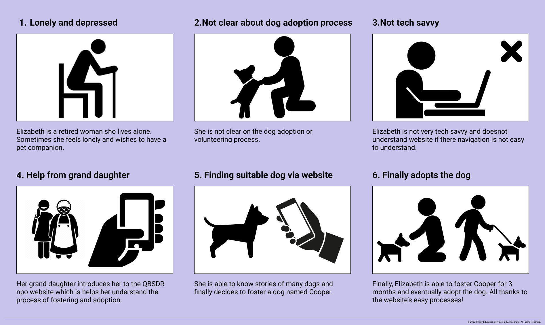
QBSDR Overview
Increase pet abandonments and overcrowding in animal shelters. To have much resources to save animals, Corgi.
To promote welfare of rescued and corgis in general
To seek donations that help run the organization
To encourage volunteering, fostering and adopting
Role
UX/ UI Designer
Timeline
October- November, 2022
Tools Used
Pen & Paper, Figma, Miro, Trello, Photoshop, Zoom, Google Meet
Team Members
Angle Wen
BoSung C Yoon
Caitlin Bush
Priti Srivastava
Final Desktop


Our Dogs Page

Foster- Adopt Page
Final Mobile

Foster parent and Volunteer application form made to be consistent look.
Adoptability by Levels
Donate Page
Mainly focus on hamburger menu and heiarchy order, instead of alphabetical order that Donate is the most important and then to Events.
Also, instead of filp page, it slide in the page.


Volunteer Page is mainly designed by me.
Main top section is divided into 4 categories, volunteer, application form, my profile and review pages. The volunteer levels divided into types, all, intro, intermediate and advanced levels.
The Problem
Impulsive buying and unethical breeding practices increase pet abandonments and overcrowding in animal shelters. Too many animals to be saved but so little resources. Small rescue groups, such as our client Queen’s Best Stumpy Dog Rescue, struggle every day to find much-needed resources to save an animal in need.
The Solution
It is our goal to redesign QBSDR’s website that will increase the number of patrons and subsequently obtain more donations and volunteers that help their operation as a corgi-dedicated rescue organization.
Research Phase
Initial Interview with Skateholder
We are fortunate to successfully reach out to Julia from QBSDR and set up an initial interview to know more in depth about the organization. We’ve gathered crucial information about how the organization was founded, their operations and insights on the overall mission they aim to achieve.
Increase in cash donation is the most important goal of the organization
Secondary goals are volunteer and foster
DO NOT CHANGE
Royal Purple color
New logo must contain corgi and crown
UI Website Analysis
Heuristic Analysis
Header Navigation
Clean and simple. Contain only one level of menu.
Labeling system is easy to understand.
Landing Pages
Our Dogs Page
Dog are grouped into 4 categories but dogs under each category are not sorted in any meaningful manner (not by alphabetical order, age, or day rescued)
Dog stories are long and text
Footer
Contact info is scattered and not logically grouped together. Email address is difficult to spot.
How to Help Page
Donate section is duplicated from Donate Page
Foster section is centered aligned while other sections are left aligned
Volunteer section is long and text-heavy. Volunteer positions are not sorted in any manner.
Content Header and Body Text Alignment
Inconsistent use of centered and left alignments throughout the website.
Donate Page
Ways to make cash donation are not clearly explained.
Chewy.com wishlist is missing on this page
Donate buttons everywhere throughout the website
Application forms long & no profress shown
User Reseach
User Survey & User Testing Objectives
Guerrilla User Testing
We conducted a Google Survey to find out what users’ donation habits and what they typically think it’s important when looking for a Non-Profit Organization to make such donations.
We’ve received 10 responses:
70% had donated to a NGO
80% consider first the dogs personality traits when adopting, etc.
For the User Interviews we collected qualitative data from each participant.
5 Individuals were chosen from the proto-personas created that fitted those specific characteristics.
User Interviews
5 Individuals: Mid 20’s to 60’s
Specific oriented tasks
Opened ended questions
Important KPIs
Financial KPIs
As a small NGO, Financial KPIs will be extremely crucial for the survival of the organization and the survival of the corgis they rescued also depends on it. Therefore, their website redesign should be donation-driven: Encourage donation. Increase donation. And secure donation.
Personal KPIs
Volunteers and donors keep small NGO like QBSDR running. Their website redesign should be people-centered: Attract people. Connect to people. And Retain People.
User Persona
Potential Foster and Donor

Potential Volunteer

Problem Statement
QBSDR website was built to attract potential donors/adopter/volunteer who will contribute to their corgi rescue mission. We have observed that QBSDR website isn’t providing easy access of such information and the content is too text heavy, which is causing potential donors/adopter/volunteer confusion, losing interests and leaving the website.
How might we improve QBSDR website so that the users can obtain easy-to-understand and well-organized information about volunteering, donating and fostering while using the website, and consequently increase the donation, as well as the volunteer and foster application?
Ideation Brainstorming
Areas to UI Design
After Ideation, each members organized areas to redesign (Navigation, Organization, User friendliness) and potential areas (Donation Driven Features, User- Centered Features). You can see all the details through the Ideation button.

Storyboard
Sitemap
Lo & Mid- Fi Prototyping & Iteration
Lo- Fi
After Lo-Fi user testing results and skateholder’s feedback, each members build Mid-Fi based on Lo-Fi feedback. We decided to separate the “other ways to help” section and add a tab dedicated to this section on the Donation Page.
After Mid-Fi user test and results, we have done 2nd iteration of Mid-Fi.
Positive Feedback
Relatively easy to find information
Majority of contents are easy to follow and understand
The tabs are very helpful for searching and browsing contents
Appreciate the “sort”, “help” buttons and highlights of the dog stories
Blockers
Users do not like the colored drop-down menu. The ease in and out action looks awkward
The secondary level of menu of under “Our Dogs” do not provide enough information about what “Beginner”, “Intermediate”, “Advanced, ad “Sanctuary” means. It’s confusing
On “Our Dogs” page, the explanation of the “levels should be brought up to the top so users can be taught what each level means before clicking the tabs
Wish there’s a search bar
Lo- Fi Prototype User Test
Lo- Fi Prototype User Testing Results & Stakeholder Feedback
Mid- Fi
Hand-drawn wireframes were used because of it’s speed and advantage to ideate many possibilities quickly.
Below are key wireframes for the 5 main pages that has unique features.
Method
We conducted 5 usability tests via Zoom/Google Meet and asked the interviewees to perform 5 essential tasks previously mentioned.
Objectives
Is the new navigation (header and footer) intuitive?
How easy or difficult is it for the user to find a certain landing page?
How well/bad is the information organized within the new lo-fi prototype?
Tasks
Can a user find contact information and the team page?
Can a user find information about volunteering in QBSDR and apply?
Can a user find a corgi in advance level and sponsor that dog?
Can a user find how to become a foster and apply?
Can a user find information about how (how many ways) to donate to QBSDR?
Overall Feedback
Structure of the navigation is very clear
Navigation is clean and simple, making the landing pages are easy to find
Tabs on the landing pages makes content well-organized and easy to browse
Dog overviews and sort function make content easy to read
UI Design
UI Style Guide
Stakeholder’s Request to keep
Royal Purple Color Theme
Logo with Crown

Hi Fi Prototyping & Iteration
A/B Testing
Hi-Fi Prototype


It’s the stakeholder request that we put more emphasis on sponsor program so we asked our users in which set of buttons does “Sponsor” pop out more?


80% of our users picked B
QBSDR’s design and app was finalized after several rounds of revisions and usability testing.
Future Iteration
A Big Dog in a Small Package” … … “A Big Mission in a Small NGO”
During the redesign process, we grow more attached to the corgis and QBSDR. Despite the size of the organization we believe they are making a difference in saving corgis. We intend to continue working with QBSDR after this and help them:
Create a well-organized FAQ page
Create a “Foster Portal” for foster parents to post updates and status on the fostered Corgis.
Implement the “Sponsor-A-Low-Rider” program further and start a “Virtual Adopt” program
Online fundraising
Work with local artists in designing corgi merchandise to raise more money for the rescued corgis