Department of Energy (DOE)
Redesign Government Organization Website & Mobile
DOE Overview
In this website redesign project, our members are asked to choose a government website, analyze and determine its usability issues, and propose a solution to those issues with a new UI style. U.S. Department of Energy (DOE) is the government website of our choice.
GOAL
As the nation’s energy authority, DOE provides the Americans the most current news, information and policies about energy. It is our goal to redesign the content-heavy DOE website so that the site-visitors can browse and look for desired information in a less time-consuming and more friendly way.
Role
UX/ UI Designer
Timeline
October- November, 2022
Tools Used
Pen & Paper, Figma, Miro, Trello, Photoshop, Zoom, Google Meet
Team Members
Caitlin Bush
Evan Henderlong
Angel Wen
BoSung Clara Yoon
Desktop

Main Home for Desktop and Mobile

Homepage
Homepage


Overview
For Whom is the Website Designed?
Homeowners
Business Owners
Scientists
Educators and Students
Other Government Agencies
Main Purpose of the Homepage
To promote agency’s “Clean Energy” policy
To set priorities of the agency
To announce its most recent update and press-release
Our Observation
With various types of potential visitors and massive amount of content and information, we find it necessary to create more than one proto persona to help us determine the pain points and frustrations users face while interacting with the DOE website.
Research Phase
Proto User Persona
User Path
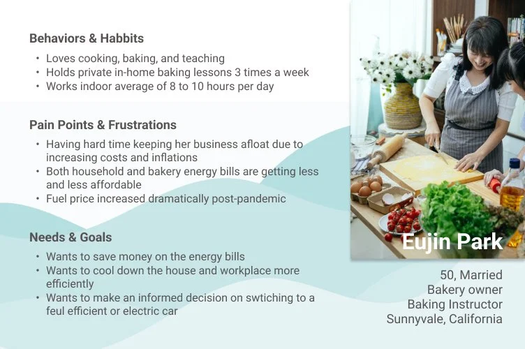
Eujin Park, frustrated with the rapid increases in the monthly energy bills for her home and bakery, is looking for energy efficient solutions to cut down the costs and expenses so she can keep her business afloat. She also wants to compare fuel efficient and electric cars on the Department of Energy website before making a purchase decision.
User Path- Finding money-saving solutions for home energy
DOE Home
>
Heating & Cooling
or
Electricity & Fuel
Proto Persona 2
User Path
James Eby, concerned over the increasing extreme weather events in the country, wants to have in-depth understandings on the topic of climate change and the solutions to the energy crisis. As a 9th grade science teacher, a father of two school-aged children and a concerned global citizen, he also wants to find resources from the Department of Energy to educate his students and children about the causes and solutions for such a crisis, and to save the planet.
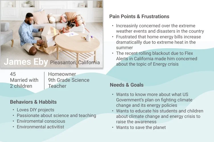
User Path- Finding resources for clean energy and climate change
Energy Saver
Science & Innovation
>
DOE Home
Clean Energy
>
STEM
or
>
Guerrilla Usability Tests & Notable Quotes
Mobile User Test
From the user interview, here are the organized uncomfortable areas.
Navigation is not intuitive
Content is scattered and unorganized
First eye-catching content on Homepage seems irrelevant
Wording and labeling are inconsistent
website is too text heavy
5 Individuals were tested on their personal phones and talk out loud about their process.
Objectives
Is the navigation on the DOE mobile website intuitive?
How easy is it for users to understand the navigation and where things are placed?
How is the navigation organized and positioned on the DOE website for mobile?
To find out what the user dislikes about the current mobile DOE navigation
From the user tests
unable to quickly find Careers page
cannot read, just scrolling
User Interview
User Research
Each members interview who are either teacher, working related to Energy and students. We conducted 5 usability tests via Zoom/ Google meet and asked the interviewees to perform 5 essential tasks previously mentioned.
Objectives
Is the navigation on the DOE website intuitive?
How easy or difficult is it for the user to browse/search through the DOE website to find certain information?
How well/bad is the information currently organized on the DOE website?
What does the user dislike about the current DOE website?
UI Design
Areas to Redesign
Navigation
As a user, it’s unclear where they need to go when initially searching for a particular topic
Hierarchy
The hierarchy aesthetically makes for a confusing user experience.
Visual Aids
The visuals don’t always give a user an insight into what topic is being discussed and there’s opportunity to offer more visuals to make the visual space more appealing with less text.
Organization
The overall organization of information is overwhelming for users and makes for a lack of clarity around where users will find things.
After Ideation, each members organized areas to redesign Navigation, Hierarchy, Organization, Consistency, Visual aids, Labeling. You can see all the details through the Ideation button.
Labeling
Labels for subject areas, content and links don’t provide enough context for users.
Consistency
The formatting of pages, and general landing pages don’t align to the same format as other pages and needs more work done there.
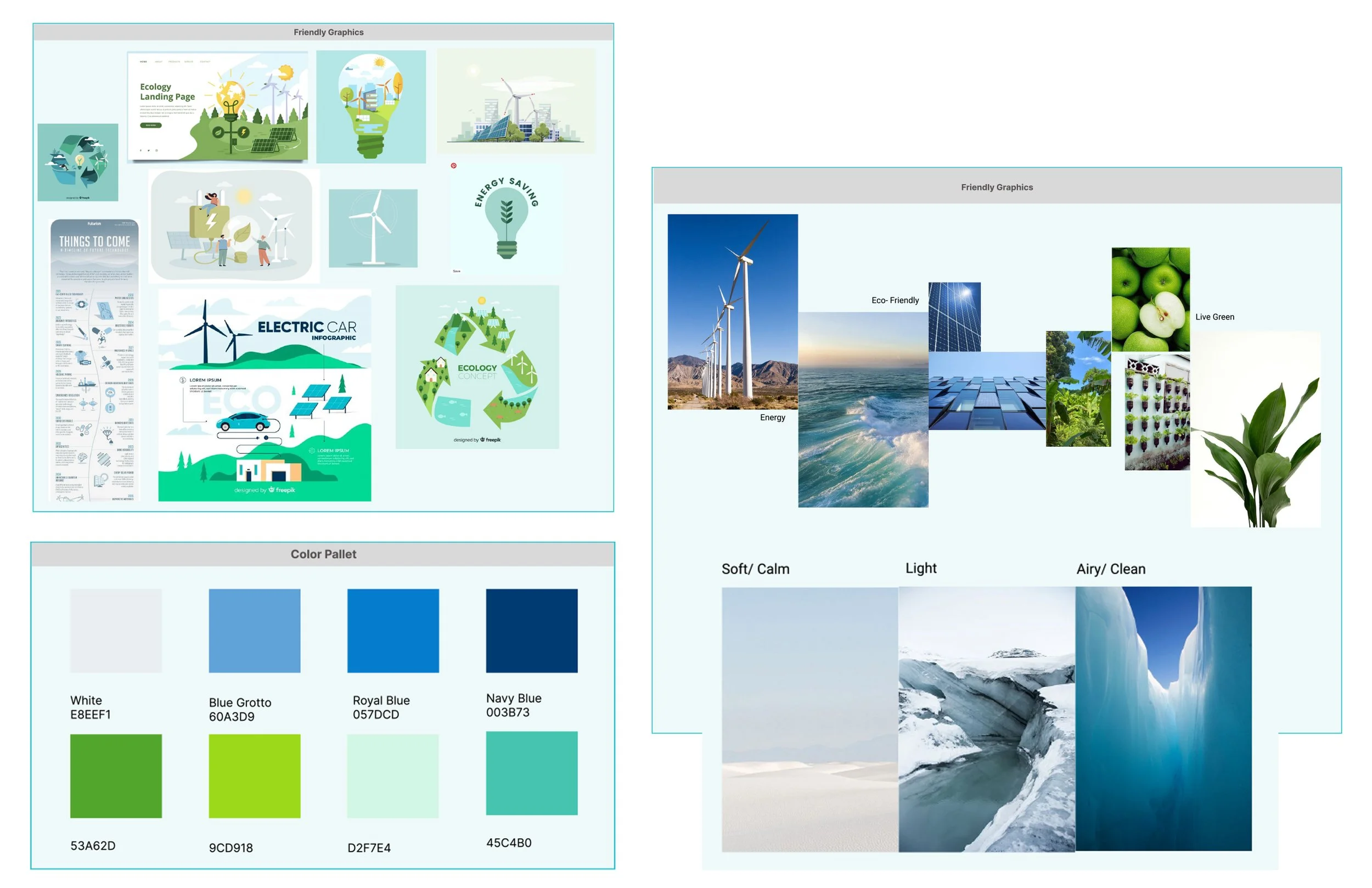
Moodboard & Inspiration
Each members found and collect UI elements and layout, friendly graphics. Also, we organized color and inspiration board.
You can see how UI style is organized, font, logo, icons, button, color, graphic pattern and images.
Ideation Brainstorming

Card Sorting & Sitemap
Our group members worked on Card Sorting by defining Header, Footer and dividing three levels, primary, secondary and tertiary pages. After regrouping to pick out flaws in organization and make more sense to the user, we have done restructured. Priorities of the agency should be clearly conveyed and organizing them by types of audiences.
Navigation items on all levels are organized by hierarchy, primarily based on DOE’s priorities, as a U.S. government entity bears a responsibility of clearly conveying and guiding citizens on the important current policies. However, users’ preferences are also considered for a more friendly navigation in “Energy Efficiency & Savings” section.
Some changes are made on the labelling for easier user comprehension
Lo & Mid- Fi Prototyping & Iteration
Lo- Fi
Desktop Lo- Fi

After Lo-Fi user testing results and skateholder’s feedback, each members build Mid-Fi based on Lo-Fi feedback. We decided to make clean and airy style without overcrowded elements in the images. We have done redesign iconography, typography, images, button, logo. For Mobile, we have done to retain the same layout and style as desktop homepage for consistency.
After Mid-Fi user test and results, we have done 2nd iteration of Mid-Fi.
Mobile Prototype
Lo- Fi Prototype User Test
Lo- Fi Prototype User Testing Results & Stakeholder Feedback
Mid- Fi
Desktop Prototype
After sketching out designs on paper, mid-fidelity wireframes and prototypes were created.
Once a clearer idea of how to design the screens emerged and using the paper sketches as a foundation, mid-fidelity wireframes and prototypes were created in Figma. These versions included more details and interactivity to better communicate the form and function of the app.
Mobile Lo- Fi

Method
We conducted 5 usability tests via Zoom/Google Meet and asked the interviewees to perform 5 essential tasks previously mentioned.
Objectives
Is the navigation on the DOE mobile website intuitive?
How easy is it for users to understand the navigation and where things are placed?
How is the navigation organized and positioned on the DOE website for mobile?
To find out what the user dislikes about the current mobile DOE navigation?
Tasks
Can a user find the Nav bar and identify the 4 main areas of the DOE?
Can a user go to the Save Energy save Money tab and return to the home page using the navigation bar?
Can a user find the careers page?
Can a user find information about STEM?
Overall Feedback
Color scheme feels clean, modern, cohesive
Photos and content were well balanced; very clear and easy to read and look at
Appredicated the text overlay on pictures; this made it very clear what was what.
Hi Fi Prototyping & Iteration
UI Style Guide
UI Breakpints and Grids
Desktop 1024px
12- COLUMNS
Gutter Width 20px
Margins 70px
Grid 21px
Key Elements
5 Second User Testing
A/B Testing
Hi- Fi Prototype
Each members redesign for Animation, logo, accordion, breadcrumbs, graphics, typography, etc.
Each members redesign for Animation, logo, accordion, breadcrumbs, graphics, typography, etc.
Mobile 414px
5- COLUMNS
Gutter Width 16px
Margins 16px
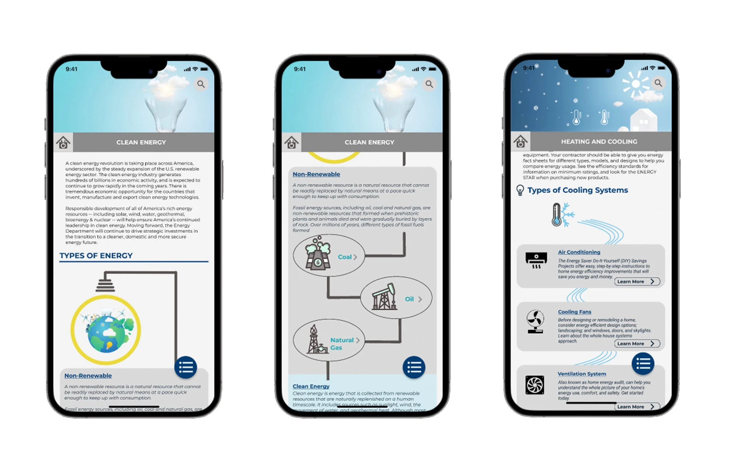
Add an animated welcome page as the first user interaction point of the website
Clean up the header cluster and create a expandable hamburger menu
Create current trending topics tiles for users doing general browsing
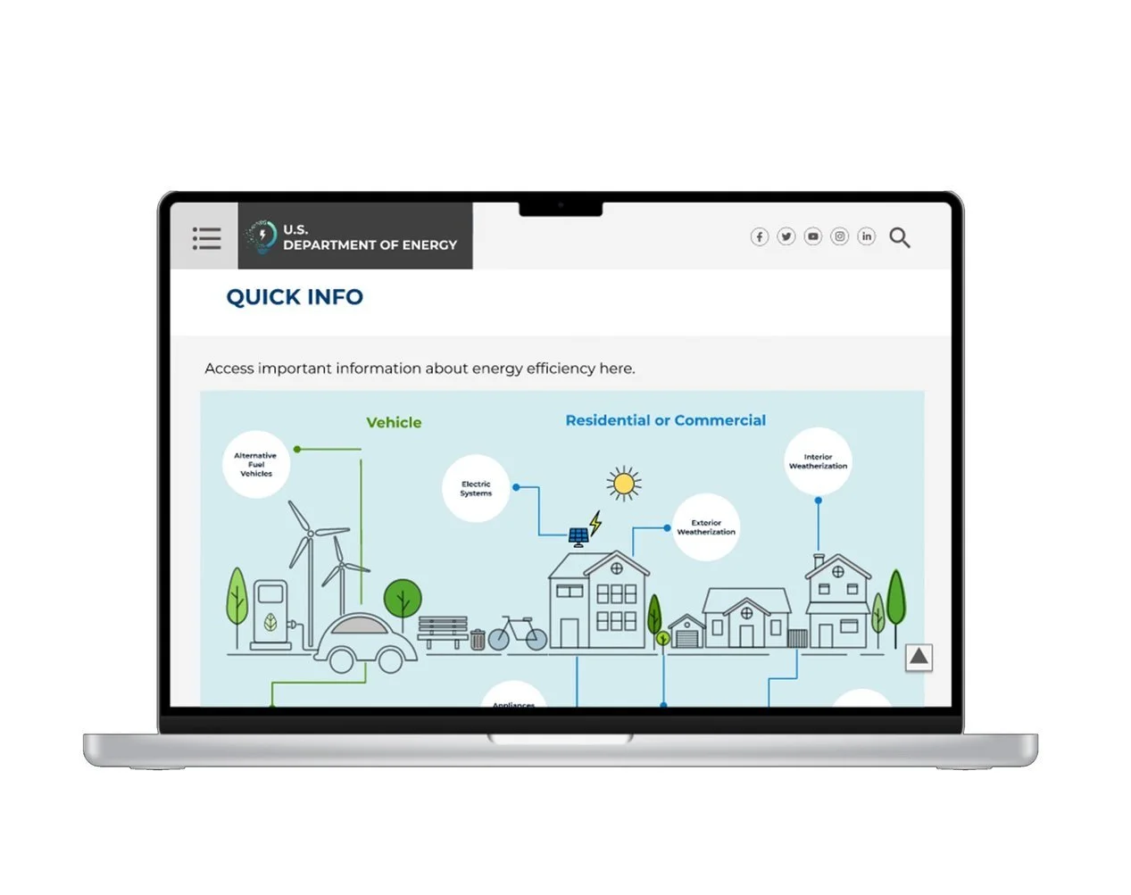
Create infographics as shortcuts for users doing specific searching
Create organized carousels for latest news and DOE blog
Give DOE a new logo that better reflects its purpose and mission
Hamburger Menu as primary navigation has four levels of navigation that will carefully guide the users to the specific landing page they are looking for
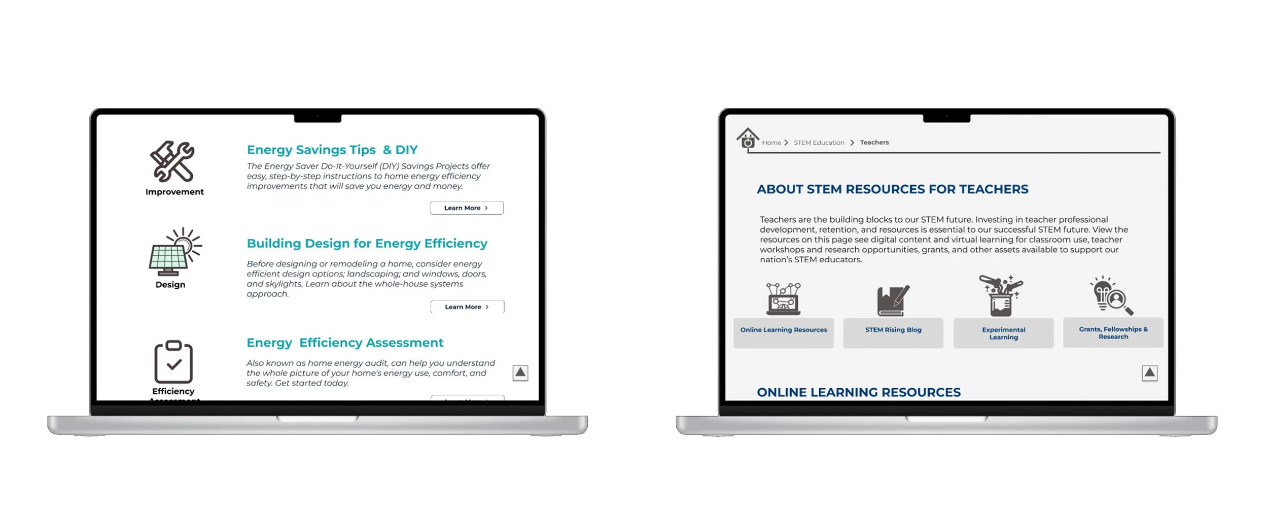
Breadcrumbs that allows users to know their current location on the website and quickly jump to the upper level pages as they wish
Content navigation tabs that takes users down to the desired section of the page without long scrolling action
Back-to-Top button that saves users time from scrolling
Each members test color scheme, photos and balanced text and pictures.
Each members test out pop- out menu that positioned horizontally or vertically. Second, each member tested alphabetical or hierarchy order. Third, we tested location and size of floating menu button for mobile.
Results
Nested vertical menu
Hierarchical order
Floating menu on lower right side 60x60px
Department of Energy website design and mobile app was finalized after several rounds of revisions and usability testing.
Final Iteration
Future User Testing Results
Users were asked to complete 5 tasks as those in initial user testing and the results are:
95% tasks completion and spending 10 sec/ task average
The only issue Users encountered is finding “Windows” in “Exterior Weatherization” because windows can also be considered as an interior element of the house. Also some minor issues such as icons and buttons not working properly but did not affect the outcome of the user testing. But overall, the struggle only lasted a few seconds and users quickly completed all tasks
Overall Feedback
Design is clean and information is well-organized
Good use of info tiles and infographics enhances usability
Breadcrumbs provides a clear indication of the user location
Organization of the navigation makes most sense
Animated welcome page is an added bonus